kellyaster,
@kellyaster@lemmy.world avatar

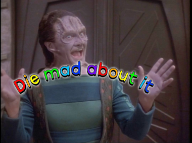
Ok, so I’m torn on this, the drop shadow/3d effect of your remaster makes it easier to read, but there’s something really funny about the font you used in the original…you know those plastic alphabet letters with the magnets on the back that started off as a kids toy and are now used by adults as fridge magnets? Yeah, that’s what the orig reminds me of. It just feels more effective from a trolling perspective.

But the color saturation and more effective type treatment in your remaster really makes it pop! And I hate using that word, it reminds me of my past life in marketing but it does fuckin pop off the screen like it’s going to smack me in the face. It is undeniable and impossible to ignore. That rainbow is faaabulous

OG: 9/10

Remaster: 9.5/10

A+++++ good remaster would review again

ummthatguy,
@ummthatguy@lemmy.world avatar

Thanks. Though I can’t take credit for the original and have no idea who to thank. Presumably, someone from the place we don’t talk about.

kellyaster,
@kellyaster@lemmy.world avatar

Ah, well I hope they appreciate the upgrayyed. It’s def an improvement!

Funny you mention that, I was gonna make a reference to The Bad Place (reddit) recently, and I realized it can have additional meaning for a lot of us 10F’ers. We have like double internet refugee status lol

ummthatguy,
@ummthatguy@lemmy.world avatar
andrew_bidlaw,

It’s okay as long as it’s consensual.

LopensLeftArm,
@LopensLeftArm@sh.itjust.works avatar

This is hands down my favorite reaction image

Zink,

Same. I think the “pop” in the remastered text helps the funny because it draws your eye to read the text first then realize who is standing behind it and how perfect his face is.

  • All
  • Subscribed
  • Moderated
  • Favorites
  • tenforward@lemmy.world
  • fightinggames
  • All magazines